Designing Binaural.
Binaural has reached version 1.2. I think this is the perfect time to write a making-of of sorts.
For starters: why did I make a binaural beats app? Well, long story short, I wanted one and the ones in the App Store kinda sucked. Mind you, not all with the same magnitude - but still.
I knew I could do better than that, but by how much? Did I have anything cool to bring to the table? Cool enough to be worth the effort of making a whole, shippable app?
First Steps
Every app I’ve designed before Binaural can be roughly categorized as a “tool”. Take this bit of UI from Samples 3.4 - which is what I should be finishing off instead of writing this article - as an example:
Hopefully you’d look at the control pictured above, even without knowing what it does, and say: “I think I can trust this”, “It looks professional”, “It’s gonna be precise”, “It might help me get my job done faster”. It’s all about trust, functionality, getting shit done. The job of the visual design here is simple: let the reliability, effectiveness and elegance of the underlying code shine through, unfiltered.
In other words, the best you can hope for is your user being happy as a side effect of the app functioning as advertised.
Binaural was gonna be different. While a binaural beats generator is undoubtedly a “tool”, what matters most is the experience. Its purpose is not to generate a specific sound, but to help people relax, fall asleep, meditate. I could finally, for real, design something from the ground up around an emotion, and that got me excited.

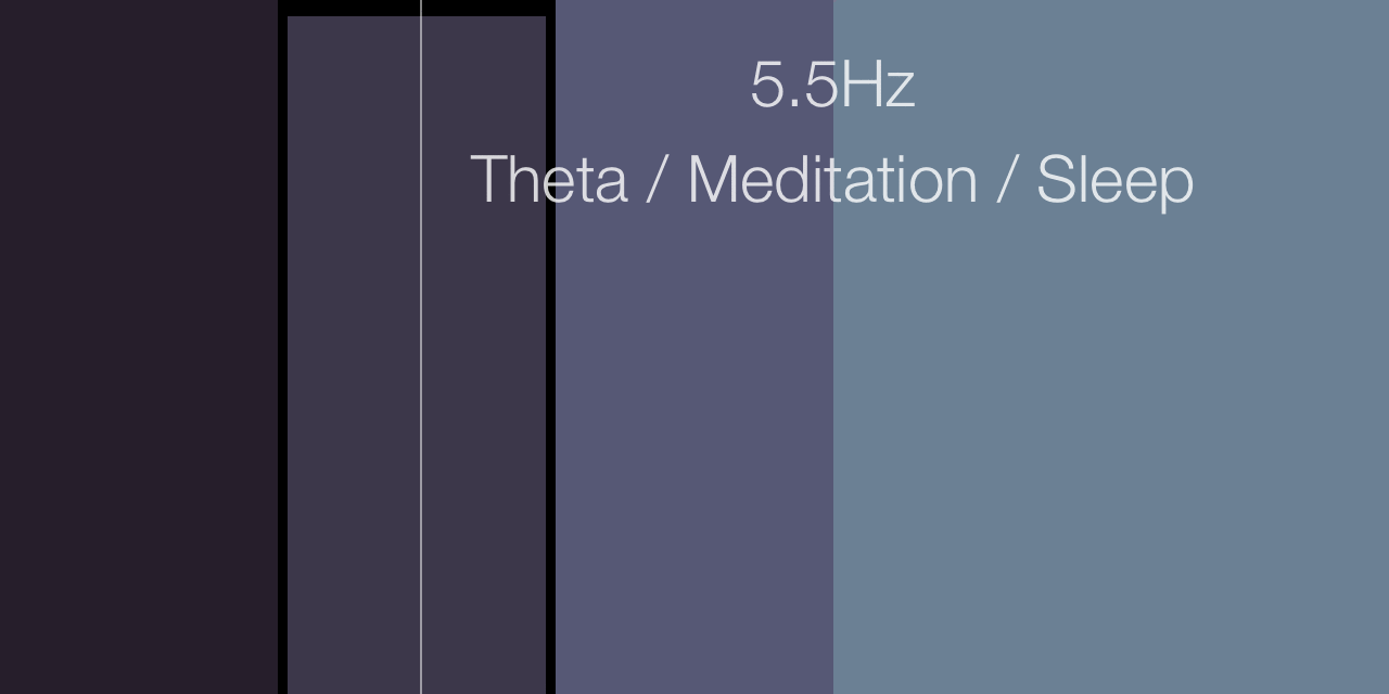
At this time I hadn’t really committed to the project yet, but I was thinking about it from time to time. The first idea I had that made the final design was to utilize ~100% of the screen for the frequency picker control, arguably the most important. It works more or less like a gigantic slider, except you can “jump” to any frequency and there’s no visible knob.
Then I started thinking about the project as a whole, and who it was for. I decided I would still support the hyperfocus/flow crowd, but heavily optimize for the relaxation/sleep/meditation area, as that is what most people use binaural beats for.
Because of that, I wanted everything in the app to help create the feelings that are associated with those activities. It had to be soothing. There could be zero frustration, or confusion. Nothing sudden or alarming could happen. I wanted the screen to produce less light than the average app, in case someone left the screen on while listening in the dark, and because light shined right into your eyes tends to make you more alert. And because I knew that many users would turn the display off while listening, I knew I had to make Binaural easy to control via the lock screen, or headset buttons.
I found people I could help, and had a vague but promising idea of how. Sold!
Features
Deciding which features I wanted in the app turned out to be pretty simple.
-
Choosing a beat frequency
Could I have made a 10Hz-only binaural beats app? Sure, but I had no way to make that a better app than one where you select your own frequency. Choosing between a finite group of preset frequencies could work, but it’d result in a boring app with no fiddle factor. Instead, I’d like users to play a little, explore, and find their own magic number (I have mine! Can you guess it?).
-
Starting and stopping playback
Since playback is explicitly started by the user, it can be immediately audible even if the device is on vibrate. No “I hit play and nothing happens” support emails for me.
-
Adding noise
Some people find raw binaural beats hard to listen to, so they need some “flattening” sound mixed in. Ironically, that sound is usually noise.
-
Sending feedback about the app
As in all of my apps. User feedback shouldn’t drive development, but it can always help inform it. Plus, you always discover some unexpected use cases.
What was harder was making an app that only had those features. Here are the highlights of that journey, which I thoroughly enjoyed.
Engine
Writing the actual binaural beats generator was surprisingly simple. After all, it’s just two sine waves playing in different channels, and the frequencies are easy to compute. I’m sure it’s even easier if you’ve written an Audio Unit before!
The generator exposes a very straightforward interface to the rest of the app, which at this time was bound to a couple UISliders and UIButtons that I just slapped onto my window at random in Interface Builder. Here are the interesting bits, in good ol’ objc:
@property (nonatomic) double beatFrequency;
@property (nonatomic) double noiseLevel;
- (void)play;
- (void)pause;
To generate binaural beats, there are a minimum of two parameters that need to be fed to the synthesizer:
-
Beat Frequency
The frequency delta between the left and right channels. This determines entrainment - i.e. it’s what your brain “tunes” to.
-
Carrier Frequency
The central, average pitch of the left and right channels. This is more or less the perceived pitch of the resulting stereo sound.
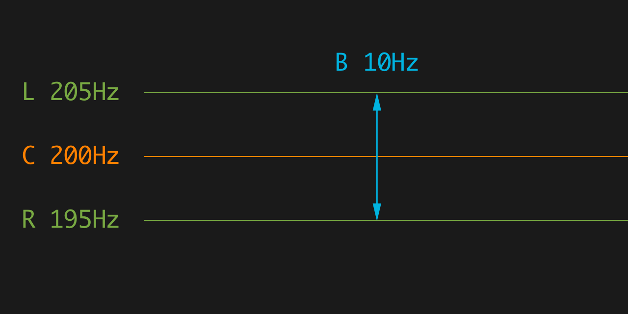
As you can see, there’s no carrier frequency parameter in my generator. Controlling the carrier frequency was not one of the end user features I wanted to have in my app, so I tried not to have it in every possible way.
I searched the web for a while, until I found this guy named Gerald Oster, who doesn’t have a Wikipedia page, but apparently has published a bunch of stuff on Scientific American.
Dr. Oster was really into binaural beats in the 70s. He studied them for a long time, and he ended up figuring out a curve describing the optimal beat frequency for every carrier frequency, known as “Oster’s Curve”. He studied a bunch of other stuff too, including what your eyes see when you squeeze them, and he loved that stuff so much he painted some Op art with it. He died in a robbery in 1993.
I obviously wanted to implement this curve in the app. The problem is, when people say “curve” I think of a continuos function. Oster’s Curve is more like a set of measurements, a bunch of points. It also does the exact opposite of what I needed (carrier → beat vs. beat → carrier). And I can’t math.
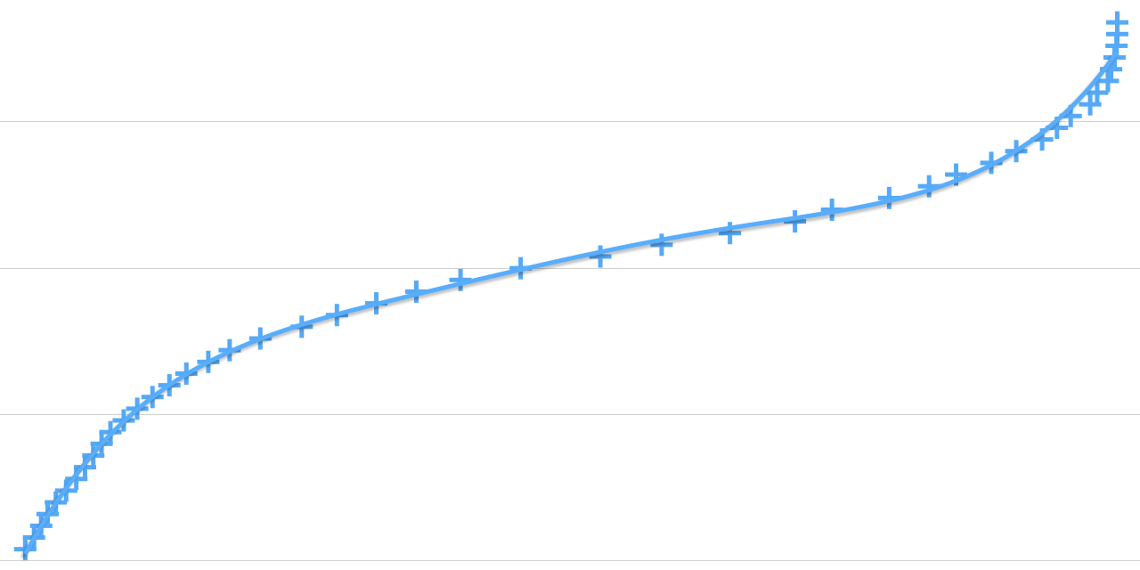
This is when I launched Numbers for the first time, and copy-pasted the <table> with Oster’s points from a webpage into the spreadsheet.
From there it was just a matter of swapping two columns, making a scatter chart, choosing an interpolation method - via brute force -, and checking Show Equation. And there it was, my continuous function. Do you even math bro?
But that wasn’t enough. As you can see above, the fit from Numbers was good, but not great - a polynomial fit wouldn’t cut it. The pitch shift resulting from sliding the frequency control around had to be very smooth and sound natural, almost an obvious consequence of your gesture. Jumps and sudden accelerations would be jarring.
Moreover, that function produced pitches ranging from low enough to be inaudible via standard-issue Apple earphones, to high enough to sound like nails on a chalkboard.
So I summoned @DavideLiessi, who can math. He was cool enough to come back with this great-sounding, cubic-spline-based, range-constrained, 100% accurate fit. Thanks man!
Add microfades, add secret sauce, ship it.
Frequency Control
The engine was up and running, and the carrier frequency was no longer an issue. Time to write that beat frequency picker control that I had hallucinated about.
Static Features
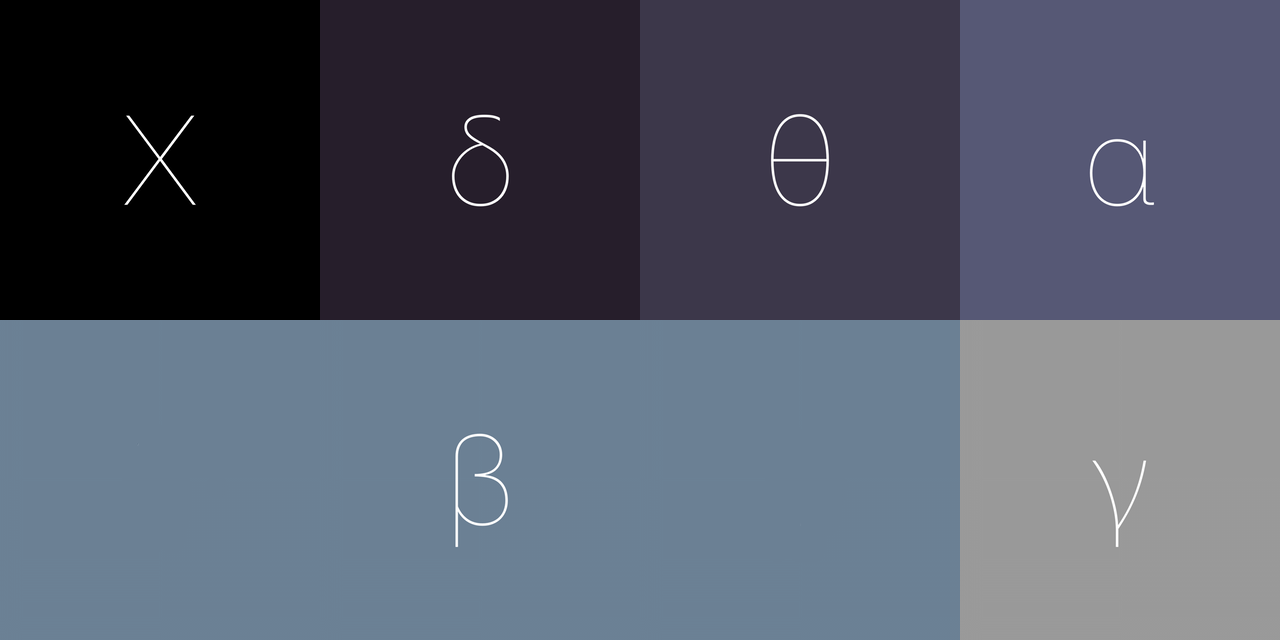
The different brainwave frequency bands are represented as vertical color bands. I got the inspiration from a book (!) about color theory that I was reading back then. I love how your eyes and brain transform some juxtaposed, flat color bands into subtle gradients.
Speaking of frequencies, Binaural’s color palette mimics the high frequency, low wavelength end of the light spectrum.
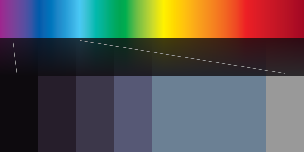
While there appears to be no solid scientific evidence of why (correct me if I’m wrong), blue and green are almost universally considered to be the most relaxing colors.
I went with dark shades of blue, because they’re associated with the night sky and, hopefully, rest and sleep. This decision seems to be pretty common in this niche, although it’s not hard to find binaural beats apps with white or orange backgrounds (!).
I love the combination of uneven bands - the beta band is much wider than the others - and hand-picked colors. I think it has more character than any generated banded gradient could.
All of the colors I picked are dark and desaturated, in order to make the screen less of an annoyance in the dark, and to provide good contrast with the white text and controls.
By the way, iOS 8 has a new “grayscale” accessibility feature that nicely doubles as a tool to make sure there’s enough contrast in your UI.
Dynamic Features
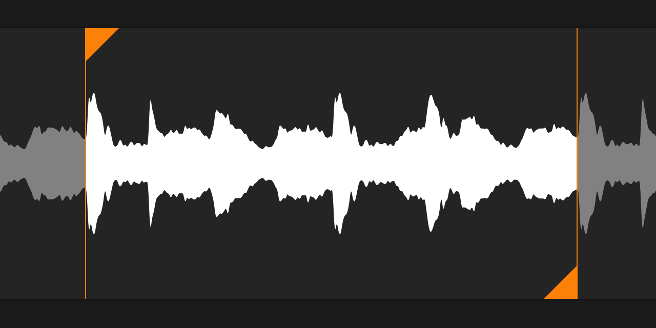
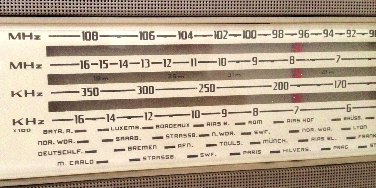
So there I was, staring at the bands. Obviously, they needed to visibly react to touches, somehow, and the vertical hairline following your finger (which reminds me of those tuners on old radios) wasn’t enough.
As you can see above, in the first version they used to recede a bit, revealing the black background beneath them. Kind of like piano keys. This had a very good, responsive, physical feeling to it, but it wasn’t very aesthetically pleasing.
The black gaps disturbed the legibility of the overlaid text, and their size didn’t mirror any other distance in the app. Additionally, the effect didn’t work as well in the wider beta band. Worse still, it might’ve looked as if they were shrinking instead of receding - which incidentally would’ve been technically correct.
What bothered me most though, was that the currently highlighted band was smaller than the others, which is counterintuitive - I just had to rectify that. The solution, however, turned out to be equally counterintuitive.
In the current shipping version, when one band is activated, all the other bands shrink, revealing a darker, but still banded, background. In other words, nothing happens at the touch site, but literally everything else changes.
This seemed silly when I first thought of it, but it worked out nicely. It doesn’t create ugly gaps, but it does create a neat separation between the two labels at the top, making them breathe a little more. Both the labels and the row of buttons at the bottom are mounted on 64p tall rows. All of the buttons at the bottom fade away during the gesture.
But most importantly, just look at the comparison above: which one feels more relaxed/relaxing? All of the tension is gone.
As a side effect, I really enjoy the “vignette” effect this creates. It gently says, time to focus on this operation only right now. It’s like in videogames, when the screen gets letterboxed during cutscenes.
But what about transitions? On one hand I wanted to avoid any sudden/quick motion to preserve the relaxing atmosphere, on the other I wanted interactions to feel immediate and responsive to boost confidence.
The resulting tradeoff: when an interaction begins animate snappily, when it ends animate gently. In other words, you only get sudden motion if you’re willingly triggering it.
I’m using spring-loaded animations everywhere, but only using overshoot and initial velocity when an interaction begins. Here the accentuated wobbling makes the bands feel alive and somehow, physically light.
Noise Control
Alas, there was still no noise in Binaural. So I mixed in a silly, dead simple arc4random() signal into the mix - a.k.a. white noise. As expected, it sounded awful.
At the same time I had added this button to toggle it, with a placeholder icon. I had no idea how to represent “noise” with an icon, but I liked the idea of just having three icons in the main screen of the app.
One quick web search later, I realized what I actually needed was pink noise. So I looked it up, and found two interesting things about it:
- Pink noise sounds kinda like rain. Hmmm.
- Code-wise, generating pink noise is orders of magnitude harder than its white buddy.
I already knew I was going to have 4 presets for the noise control: none, a little, some, a lot. No point in having fine control for something like that. I don’t use noise myself, so I botched the presets (too loud) in the first version. That has since been corrected thanks to user feedback.
I just had to connect the dots. ~5 iterations later, I had the current shipping icon: three white raindrops. With each tap, a white raindrop turns blue, the button bounces a little higher, and you get more noise. When they’re all blue, another tap brings you back to no noise.
As for the code, luckily Apple wrote that for me. It took literally four lines of code to integrate it and mix it in with my signal. Pardon my C++:
#import "Pink.h"
PinkNoiseGenerator *pinkNoiseGenerator = new PinkNoiseGenerator::PinkNoiseGenerator(44100.0);
pinkNoiseGenerator->Render(buffer, inNumberFrames, 1.0f);
buffer[frame] = amplitude * (sin(leftTheta) + buffer[frame]);
As I said though, pink noise sounds kinda like rain. I wanted to heighten the effect, but I had no access to the appropriate recording equipment (not to mention, weather!) to capture actual rain, and no clue how to synthesize a more realistic rain sound.
So I thought: if it kinda sounds like rain, and kinda looks like rain too, then maybe it’ll be more easily recognized as rain. So I added a full-screen CAEmitterLayer, drew a smudged white line in Pixelmator, and tweaked many constants for hours - balancing performance with realism. The result is what you see above. Yay particles!
I purposely avoided mentioning the visual rain effect in the App Store description and screenshots, I wanted it to be a surprise for first-time users, an “awwww” moment. It also looks bad in a static screenshot. But mostly it’s the surprise thing.
Buttons
Some people are hating on the borderless buttons in iOS 7. In theory, I agree. In practice, never once was I unsure whether something was interactive or not, or whether it was a button at all (it still happens, as much as before, in third party apps).
What bugs me is the lack of feedback.
Button labels get semi-transparent, and that’s it. Most of the time your finger covers them significantly, so you’re unsure whether you’ve hit the target. In Binaural, where possible, I tried to keep the labels long to counteract this.
On the main screen however, there are only icon buttons. Tapping them means that their only visible part is completely covered by your finger, so there’s no feedback at all.
I tried to fix that by adding highlight rings to them, which should be bigger than your fingertips (if they aren’t, seek medical attention). I think it works nicely, but it can only be used for square or icon-based buttons. I’d like to find a more generic solution. Any ideas?
Labels
Let’s talk type.
I really, really wanted to use Avenir Next across the app, partly to create consistency with Samples, partly because I think it fits the style I’m going for.
Partly because I have a crush on it.
When I tried however, I realized that it didn’t support greek letters! There appears to be a version that does but it doesn’t ship with iOS. So I chickened out and went back to the system font - good ol’ Helvetica Neue.
I’ve yet to try using Avenir everywhere except for the big label in the middle of the screen. If there’s no clash (can two different scripts clash?), and no perceivable increase in the app’s launch time, I’ll definitely adopt this tradeoff in an update.
That Damn Headphones Warning
In version 1.1, I introduced (what I thought was) a gentle reminder to use headphones. A blue, slowly pulsating headphones icon would appear at the top of the screen if Binaural was playing through the device’s built-in speakers.
Binaural beats are way, way more effective with headphones. Some (positive) user feedback hinted that some users were not using headphones at all, hence the idea to add an educational warning icon.
Implementing this icon required a surprising amount of work, both because the conditions that govern when it shows are complex, both because I tweaked its animation to oblivion. I was glad get this out of the door.
Then I get this review:
This app changed my life
On the first morning after I tried this out to help me sleep, I woke up feeling rested—I’d forgotten what that felt like, too many years ago. A couple of weeks later, I’m still waking early without morning brain fog. It’s a new world.
You can imagine my feelings reading this. This is pretty much why I make apps. I’d like to thank you, whoever you are, for taking the time to write that.
But it continues:
This happened without headphones, by the way, which I don’t use. Can’t stand them. So it would be nice if the new reminder to wear them could be disabled. I only updated one iPad because the flashing is a distraction.
You just made me so happy, and now I’m sad again :) But you’re totally right. I’ve added a distracting feature to the app, which went against my initial design goals. Moreover, I failed to include all of my users in the design process. Rookie mistake!
I still believe there’s value in this feature, so I just got rid of the pulsation and reduced the opacity. That got out with version 1.2, along with a few tweaks to the audio levels. And guess who updated their review?
Update: nice improvements on all counts, especially glad to be rid of the flashing headphone. The audio adjustments are appreciated, too. Thanks for the good work!
Thank you, buddy.
1.3?
There are currently 17 items in my Binaural TODO list, including a few problems I still don’t know how to fix (what is the heart button for? is the frequency control discoverable enough?), and one or two features I want to add. It might be enough for another blog post.
Also:
Would be nice if it had a timer with an auto shut off.
I think there should be a timer of how long it goes on for.
Please add a timer for those who use to sleep for.
It only needs a timer cutoff to be perfect! :)
All it needs is a sleep timer. Please- can you add this feature?
I guess I know what I’m doing next :)
But most importantly, I’d love to know what you think. So let’s talk.